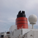
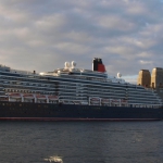
The Cunard Name
The Cunard brand can be traced back to the early days of the organisation.
When Cunard was founded, it was officially known as the British and North American Royal Mail Steam Packet Co. However Samuel Cunard was a charismatic leader, and it was not long before the press and world’s media started referring to the shipping line as ‘Mr. Cunard’s Line.’ This was later shortened to Cunard’s Line: a precursor for the Cunard Line name we know today.
Even in those early days, it was important for shipping lines to differentiate. Cunard had developed the first, financially successful, regularly scheduled transatlantic steamship service, but there was still competition from rival steamship lines as well as the sailing packets.
One way to do this was to develop a common naming convention for the ships. Cunard opted to name most of their ships after Ancient Roman Provences, with names predominantly ending in ‘ia’. This commonality allowed Cunard’s ships to be easily identified both in port, and importantly in the sailing schedules published in print media such as shipping timetables, and newspapers.
Cunard’s last ship to be named in this fashion was Caronia in 1999. Originally named Vistafjord, the ship was renamed and refurbished after Carnival acquired Cunard Line.
Queen Victoria does have an ‘ia’ name, however the name is not linked with Ancient Rome and features the Queen prefix. The first Cunarder to carry the Queen prefix was Queen Mary – named after Mary of Teck, Consort to King George V. It is this Queen naming style that is currently being used by Cunard.
Cunard Funnels
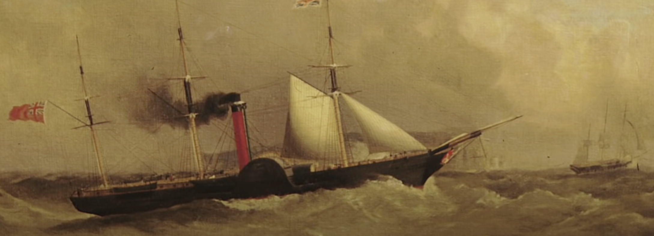
When the first four Cunarders (Britannia, Caledonia, Acadia and Columbia) were designed by Robert Napier, a red funnel colour was selected to identify these steamers as Cunard vessels.
Paint was known to peel from the hot-funnels of steamships. The funnel uptakes would conduct heat from the coal-fed boilers, which reduced the paint’s longevity.
To stop the red paint from peeling, it was thickened and mixed with buttermilk. This helped improve its longevity. However as the heat of the funnel interacted with the buttermilk within the mixture, the red paint changed in colour; to become a distinctive red-orange. This colour is quite unique, and became known as ‘Cunard Red.’
The colours on the early Cunard funnels also included a black tip. This came about as a pragmatic solution to an ongoing problem. The funnel tops on coal-powered steamers would darken from the dirty smoke. So rather than repaint them over and over, it was easier and far more economical to paint the top portion of the funnel black.
The other distinctive feature of the Cunard funnels are their black bands (or stripes). Today, Cunard’s funnels wear two black bands, but the early Cunarders had more than this, and the number of bands was not always consistent.
These bands were actually the joints where the funnel segments were connected to each other. The joints on early steamship funnels would darken in colour due to intense heating. Cunard’s solution to this was to paint these joints black. On many of the early Cunarders, these joints were designed as expansion joints, allowing the funnels to flex and stretch under the various forces of they were subject to.
Big Changes (1969-1982)
In the 1960s, Cunard abandoned its brand consistency when it launched the Queen Elizabeth 2. QE2 entered service at a time when Cunard was trying to distance itself from the dated image of ocean liner travel.
With the jet aircraft dominating global transport, Cunard was attempting to reinvent itself, marketing QE2 as a floating resort. With QE2 sporting racy, sleek lines, it was decided that the ship would not wear the traditional colours.
Subsequently QE2, Cunard Ambassador and Cunard Adventurer all sailed with white and black funnels. QE2’s funnel remained in the white and black scheme until 1982, while never ships such as Cunard Countess and Cunard Princess reintroduced the Cunard red during the 1970s.
Cunard’s Current Funnel
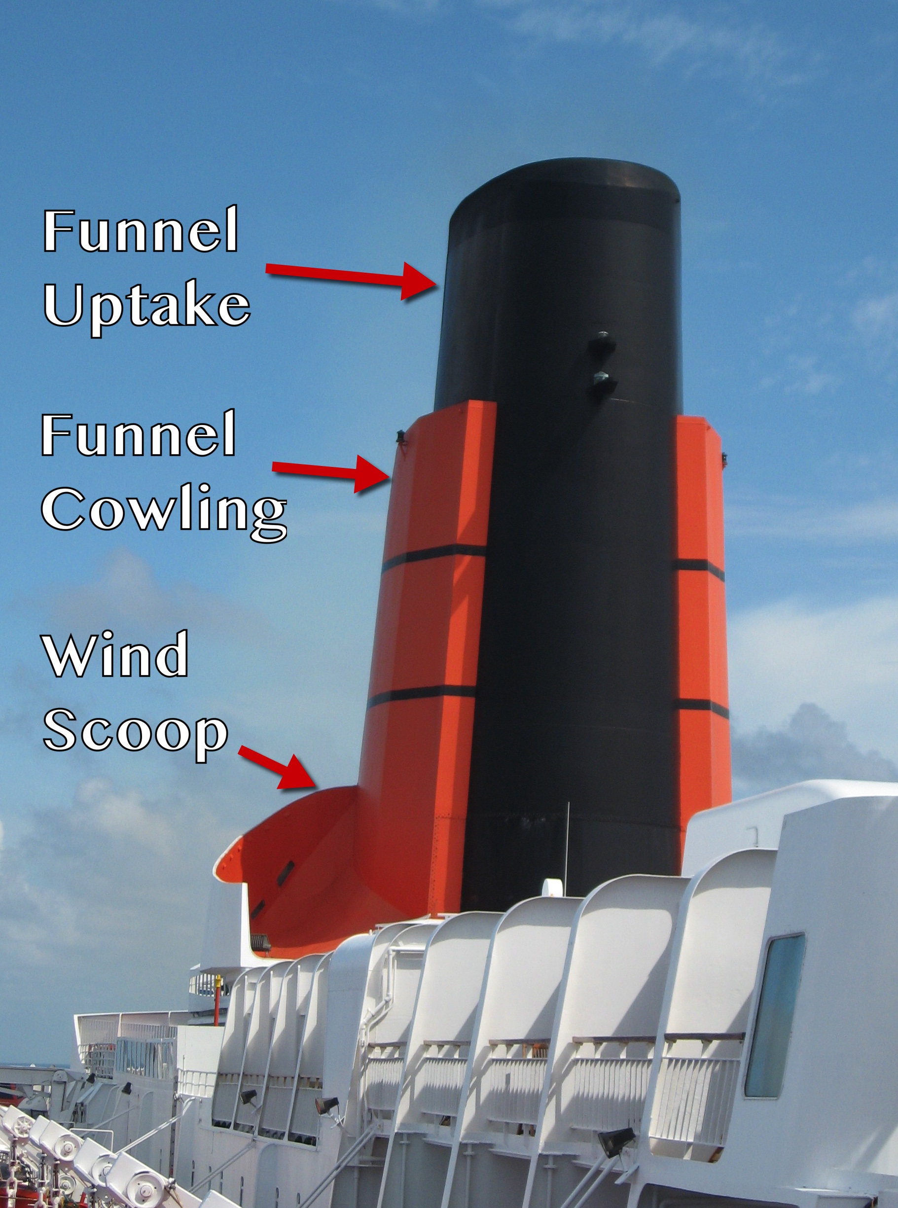
The Current Cunard funnel has a heritage that links it to both the original Cunard ships, as well taking a lot of cues from QE2.
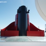
Firstly, the shape is largely based on the design introduced on QE2. This design includes a funnel update (painted black), the red cowling and a wind scoop at the base.
The scoop was a very important part of the design aboard QE2, as it helped push the air up and over the funnel when the ship was underway, reducing the impact of smoke and soot on the aft decks.
The Royal Viking Sun had a funnel shape similar to QE2’s, though this was designed when she was built for the Royal Viking Line, so it was more of a happy coincidence than a purposeful decision made by Cunard.
Queen Mary 2’s funnel was designed with the same functional features as QE2’s, while Queen Victoria and Queen Elizabeth both have funnels with the three main Cunard design features.
Interestingly Queen Anne doesn’t appear to have the scoop at the base of the funnel. This element is largely decorative aboard Queen Victoria and Queen Elizabeth, so perhaps it was deemed unnecessary for the new cruise ship which does not sport large, expansive terraced aft decks as seen on QM2 and QE2.
And there is also a link to the first Cunard ships, as the four Cunard Queens all wear the Cunard colours of black, red and the two black bands.
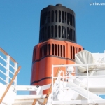
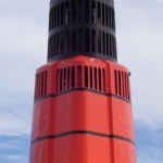
This can be traced back to the first Cunarders, however, it is interesting to note that the red used aboard the current fleet seems to be a bit less orange than Cunarders of days gone by. To see this for yourself, check out the images of QE2’s red/orange, and Queen Mary 2 , Queen Elizabeth and Queen Victoria’s funnels at the bottom of this page.
The Cunard Flag and Cunard Lion
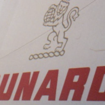 The Cunard flag consists of a red flag, with a gold rampant lion. On the observe, the gold lion faces left, as if heading across the Atlantic on a westbound crossing. It holds a globe, with the North Atlantic on display.
The design of the Cunard lion has changed a few times during Cunard’s history. Early designs showed the lion taking a step forward, with its left foot on the ground and its right foot in a stepping motion, the current design has both feet on the ground.
The original lion had a modest amount of detailing to provide contrast and shadow effect, while the current design is flattened.
Between 1994 and 1999 the Cunard lion was redesigned as a stylised outline. The lion was added to the superstructure of the Cunard fleet as a gold decal. A tri-coloured (red, blue and gold) speed stripe was also applied to the ships.
This was dropped in late 1999 when the current, more traditional design was implemented.
Header Image: Britannia, Henderson & Cremer Collection.


